The Entry Tkinter input field is a widget that offers users the possibility of entering or editing text in a single line. If the user wishes to use a multi-lines text, Tkinter offers this possibility via the Text widget.
1 - How to create a an Entry Input Field in Tkinter?
To create a label in a main window or in a parent frame we use the following syntax:
entry_name = Entry(parent_window , options = ...)
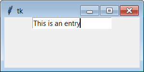
Example of creating an Entry Field Tkinter
from tkinter import *
# create parent window
myWindow = Tk()

# Creating an Entry Field Tkinter
myEntry = Entry(myWindow)
# Place the Entry on the parent window
myEntry.pack()

myWindow.mainloop ()
2 - Entry Input Options
- bg : (or background) The background color of the input area. It is a light gray by default.
- bd : (or borderwidth) The thickness of the border surrounding the input area. Its value is 2 pixels by default.
- cursor : To indicate the mouse pointer to display when hovering over the button.
- disabledbackground : The background color that is used when the widget is in the 'disabled' state.
- disabledforeground : Text color when the input field is in the 'disabled' state.
- exportselection : By default, if you select text, it is automatically exported to the clipboard. To prevent this, use exportselection = 0.
- fg : (or foreground) The color used to display the text. Black by default.
- font : Font used for the text entered in the input field.
- highlightbackground : Color of the line indicating that the button has no focus.
- highlightcolor : Line color that indicates that the button has focus.
- highlightthickness : Thickness of the focus highlight line.
- insertbackground : By default, the insertion cursor (which indicates where the text will be inserted) is black. Specify another color for this option if you want to change it. See Colors.
- insertborderwidth : By default, the insert cursor is a simple rectangle. You can obtain a raised effect (see Relief styles) by configuring this option with the size of the 3:d border. If you do that, make sure the insertwidth option is at least double that value.
- insertofftime : By default, the insert cursor blinks. You can configure this option with a value in milliseconds to specify the duration of its disappearance in the flashing. The default value is 300. If you use insertofftime = 0, the cursor will no longer blink at all.
- insertontime : Similar to the insertofftime option: duration of its appearance in the flashing. 600 milliseconds by default.
- insertwidth : Normally the insert cursor is 2 pixels wide. You can adjust this by specifying an arbitrary dimension.
- justify : This option controls the alignment of the text when it does not completely fill the input field. Possible values are 'left', 'center' and 'right'.
- readonlybackground : The background color used when the widget is in the 'readonly' state.
- relief : Used to indicate the relief used to draw the outline of the input field. See Relief styles. The default value is 'sunken'.
- selectbackground : The background color used to highlight the selected text.
- selectborderwidth : The width of the border surrounding the selected text. 1 pixel by default.
- selectforeground : The color of the selected text.
- show : Normally, the text that the user entered appears in the input area. For a password type entry, indicate the replacement character to display, often show
- state : Use this option to deactivate the input field so that the user can no longer insert text there. `` state = ’disabled '' to deactivate it, state = 'normal' to reactivate it. Your program can find out if the mouse is over the input field by querying this option which should then have the value 'active'.
- takefocus : By default, the widget will be visited by the focus when the user uses the Tab key. Configure this option with the value 0 to remove the widget from "crossing focus". For more information on focus.
- textvariable : To be able to retrieve the current text of the edit control, you must configure this option with an instance of StringVar. You can then retrieve or modify the text using the get () or set () methods of this StringVar control variable.
- validate : You can use this option to indicate that the input field uses a validation function which will be called automatically at certain times. See Manage validation.
- validatecommand : A validation function for the input field. See Manage validation.
- width : The size of the input field measured in number of characters. The default value is 20. For variable:width fonts (proportional fonts), the size of the input field is obtained by multiplying the average of the width of the characters in the font multiplied by the value of this option.
- xscrollcommand : If you expect users to enter more text than the visible part of the input field can hold, you can link your input field to a Scrollbar. Then configure this option with the set () method of the scroll bar. For more information, see Scrolling the content of an input field.
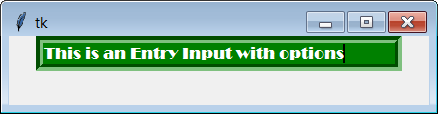
Example of Entry Input with options
from tkinter import *
# create parent window
myWindow = Tk()

# Creating an Entry Field Tkinter with options
myEntry = Entry(myWindow ,
                bg = "green" ,
                fg ="white" ,
                font="Broadway" ,
                relief = GROOVE ,
                bd=7 ,
                width=35)
# Place the Entry on the parent window
myEntry.pack()

myWindow.mainloop ()
The output is:
3 - The Entry associated methods
- delete (first, last = None) : deletes characters from the first position up to, but not including, the last position. If the second argument is omitted, only the character at position first is deleted.
- get () : returns the text that the input field contains when called.
- icursor (index) : oves the insertion cursor just before the character with the index position.
- index (index) : scrolls the content of the input field so that the index position character is at the first position visible on the left. Has no effect if the entire text fits in the input field.
- insert (index, s) : inserts the character string s just before the character located at the index position.
- scan_dragto (x) : see the scan_mark method below.
- scan_mark (x) : use this method to initiate rapid scrolling of the content of an input field with a horizontal scroll bar. To do this, link the "mouse button down" event to an event handler which will call scan_mark (x), where x represents the current horizontal position of the mouse.
- select_adjust (index) : this method is used to adjust the selection to make sure it contains the character located at the position specified by index. If the selection already contains the character, nothing happens. Otherwise, the selection is expanded from its current position (if there is one) to include the position with the specified index.
- select_clear () : clears the selection (without deleting its content). Has no effect if there is no current selection.
- select_from (index) : position the index of the selection anchor, 'anchor', at the position of the character selected by index and select this character.
- select_present () : returns True if there is a selection, False otherwise.
- select_range (start, end) : to adjust the selection from the application. Select text from start position to, but not including, the end position. the start position must be before the end position. To select all the text in the input field e, use e.select_range (0, 'end').
- select_to (index) : selects all text from the 'anchor' position to, but not including, the index position character.
- xview (index) : scrolls the text so that the index position character is located at the beginning of the input field. This method is very useful in the connection between an input field and a scroll bar. See Scrolling the content of an input field.
- xview_moveto (f) : position the text in the input field so that the character located at the relative position f (relative to the entire text) is positioned on the left edge of the field. The argument f must belong to the interval [0; 1], where 0 means everything on the left and 1 means on the right.
- xview_scroll (nb, what) : used to scroll the content of the input field horizontally. The argument what is either 'units', to indicate scrolling characters by characters, 'page' for scrolling by width of the input field. If the nb argument is positive, scrolling is from left to right, if it is negative, scrolling is from right to left. For example, for an e input field, e.xview_scroll (-1, 'pages') will move the text of a 'page' to the right and e.xview_scroll (4, 'units') will scroll it by 4 characters to the left.
Younes Derfoufi
my-courses.net
my-courses.net