About the Frame Tkinter widget
A frame is simply a container for other widgets. Each frame has its own positioning manager. Thus, the layout of the widgets in each frame is independent. Frame widgets are good tools for making your application modular. You can group a consistent set of widgets by placing them in a frame. Better yet, you can create your own frame class by inheriting it from Frame, and making your own interface for that frame. This is a good technique for hiding the details of the interactions of a group's widgets.
Syntaxe
widget_frame = Frame (master, option, ...)
- master: represents the parent window.
- options: list of the most commonly used options for this widget. These options can be used as key-value pairs separated by commas.
List of options of a Frame widget
- bg: Frame widget background color
- bd: size of the borders around the Frame.
- cursor: allows you to customize the pattern of the mouse cursor when hovering.
- height: defines the vertical dimension of the Frame.
- highlightbackground: sets the color of the highlightbackground of the Frame object.
- highlightcolor:
- relief: with the default relief = FLAT, the checkbox does not stand out from its background. You can set this option to any other style.
- width: defines the width of the frame
Example
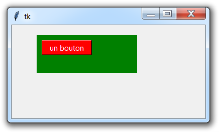
from tkinter import *

# Creation of the main window
master = Tk ()
master.geometry ("400x200")

# Creation of a green background frame
frm = Frame (master, bg = 'green')

# Frame location
frm.place (x = 50, y = 20, width = 200, height = 75)

# Creation of a button within the frame
b = Button (frm, text = "a button", bg = 'red', fg = 'white')
b.place (x = 10, y = 10, width = 100, height = 30)
master.mainloop()
Younes Derfoufi
my-courses.net
my-courses.net